🎶 Born to scroll the endless feed 🎶
Clicking was the standard way to navigate the web. Scrolling was considered bad or risky design. Early usability research warned about the “below the fold” problem, because users historically paid much more attention to content at the top of a page. Jakob Nielsen and other usability researchers emphasized placing important information immediately on page load, since early studies showed around 80% of viewing time happened above the fold. That guidance reflected how websites functioned at the time. Pages were living documents where users scanned, evaluated links, and clicked to decide where to go next, like turning pages in an encyclopedia.
Modern research shows that behavior has evolved. In Nielsen Norman Group’s 2018 study, 57% of viewing time still occurred above the fold, but attention below the fold had increased significantly. Roughly 43% of viewing time now happens further down the page, meaning users are interacting far more with content that requires scrolling than they did in earlier studies.
Enter: the feed. Since 2018, platforms like TikTok, Instagram, and Twitter trained billions of people to navigate information through continuous vertical motion. Short-form video accelerated this dramatically. TikTok in particular turned scrolling into a continuous discovery mechanism. Media scholar Tarleton Gillespie (2018) argues that platforms do not simply host content but actively organize and shape how participation unfolds online, structuring visibility and public discourse through their systems. We lost interest in turning the page and we learned to explore interfaces by scrolling. The gesture became the default way people move through digital space.
Today the long scroll page has become an increasingly common website structure on the internet. Organizations can present their story through a single vertically structured surface that guides visitors through the core narrative as they move down the page. From my perspective building sites and studying how people actually navigate them, the most effective approach is a hybrid structure: treat the homepage as a guided scroll, then connect it to deeper pages where people can explore programs, research, or ways to participate. Usability research still shows that attention drops after the first screenful, which is why the most important ideas should appear early in the page while deeper content lives behind clear navigation for visitors who want to go further.
Collections like One Page Love curate thousands of examples of websites where an entire digital presence lives inside a single narrative scroll. Browsing through them can be useful for understanding how sections are sequenced, where calls to action appear, and how organizations guide attention without relying on complex navigation.
For nonprofit organizations considering a website redesign, the long scroll can be a practical structure that reflects how people already move through information online.
01Feed.com
Is a modern homepage just another social timeline? I think yes.
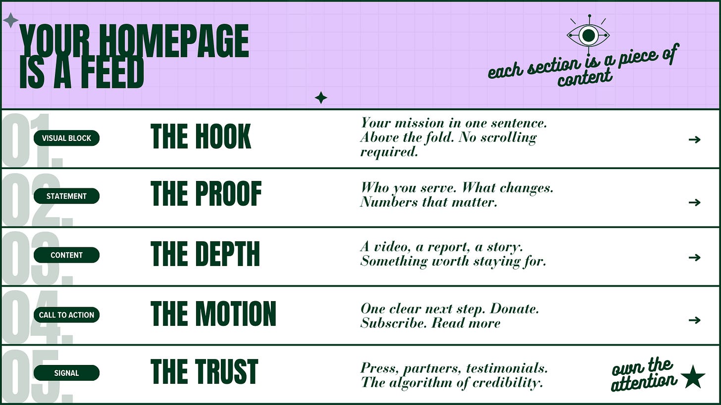
I see more organizations blurring the boundary between their website and their social presence. A TikTok profile can function like a miniature media hub. A communications director’s LinkedIn page can become a living archive of an organization’s expertise. In certain contexts these spaces behave like or even replace websites themselves.
There are still important differences. Ownership, indexing, and long-term stability remain fundamentally stronger on the open web. I wrote about those platform dynamics in my previous article on how different social systems rank and distribute content, where I explain why each platform incentivizes different kinds of behavior.
At the interface level the logic of websites and social platforms is converging. Scrolling has become the common language through which we navigate both.
02Design for the scroll
When I build websites now, I often start from a simple structure.
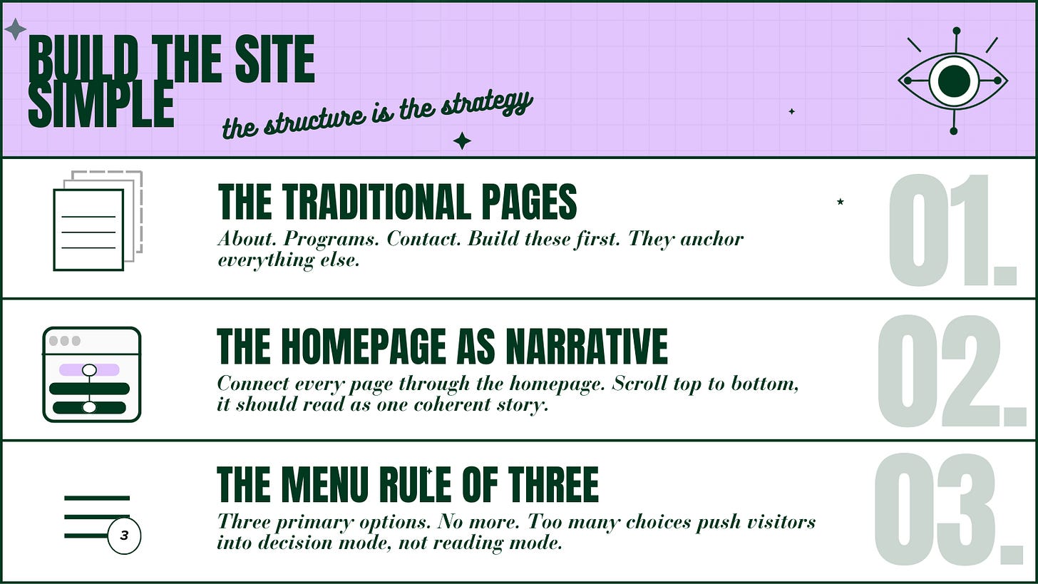
Instead of forcing users to navigate through a complicated menu, the homepage becomes a guided journey. Key ideas appear in sequence. Each section introduces another layer of context. If someone wants deeper detail they can branch into the underlying pages.
The goal is to integrate structure into the scrolling experience. In practice this means designing your homepage the same way platforms design feeds. Each section should carry a clear idea. Visual rhythm means information density needs variation so attention does not collapse halfway down the page. Assume your website visitors will scroll and make that behavior the interface.
03Feed within a feed
If I haven’t convinced you yet, let me convincingly deploy some inception: most people arrive at websites through feeds. Social media is a top news source for most Americans. That means we are primed, ready, and already scrolling from our phones. It’s likely that the most intentional users of your site will be visitors acquire from platforms like TikTok. You need to stop the scroll and move them from that platform to yours. They click from Instagram, LinkedIn, TikTok or follow a link from a newsletter. The entry point is already part of a scrolling environment. A page that continues that motion feels frictionless.
This has created new variations of the traditional marketing funnel. Organizations now maintain multiple entry points connected to different feeds. A TikTok audience may land on a simplified landing page designed for fast comprehension. A LinkedIn audience may arrive through a research article or long-form analysis. A newsletter reader may enter through a deep blog post.
The website becomes the center that connects those streams. Each feed delivers attention in a slightly different way. Your site absorbs that attention and gives it structure.
04The scroll changed everything
Scrolling is now the default motion of the internet. Feeds changed the way people move through information. Your website needs to adapt. Marketing is now fundamentally multi-channel. HubSpot (2026) reports that 75% of teams operate across five or more platforms, while social media, websites, and search remain the highest-performing channels by ROI. In practice, this means organizations no longer operate a single digital presence but an ecosystem of interconnected surfaces.
The long-scroll page is an architectural response to the behavioral patterns platforms trained us to follow. In other words, the web learned how to scroll. Designing with that reality in mind means arranging information so it unfolds naturally inside the gesture people already use to explore digital space.